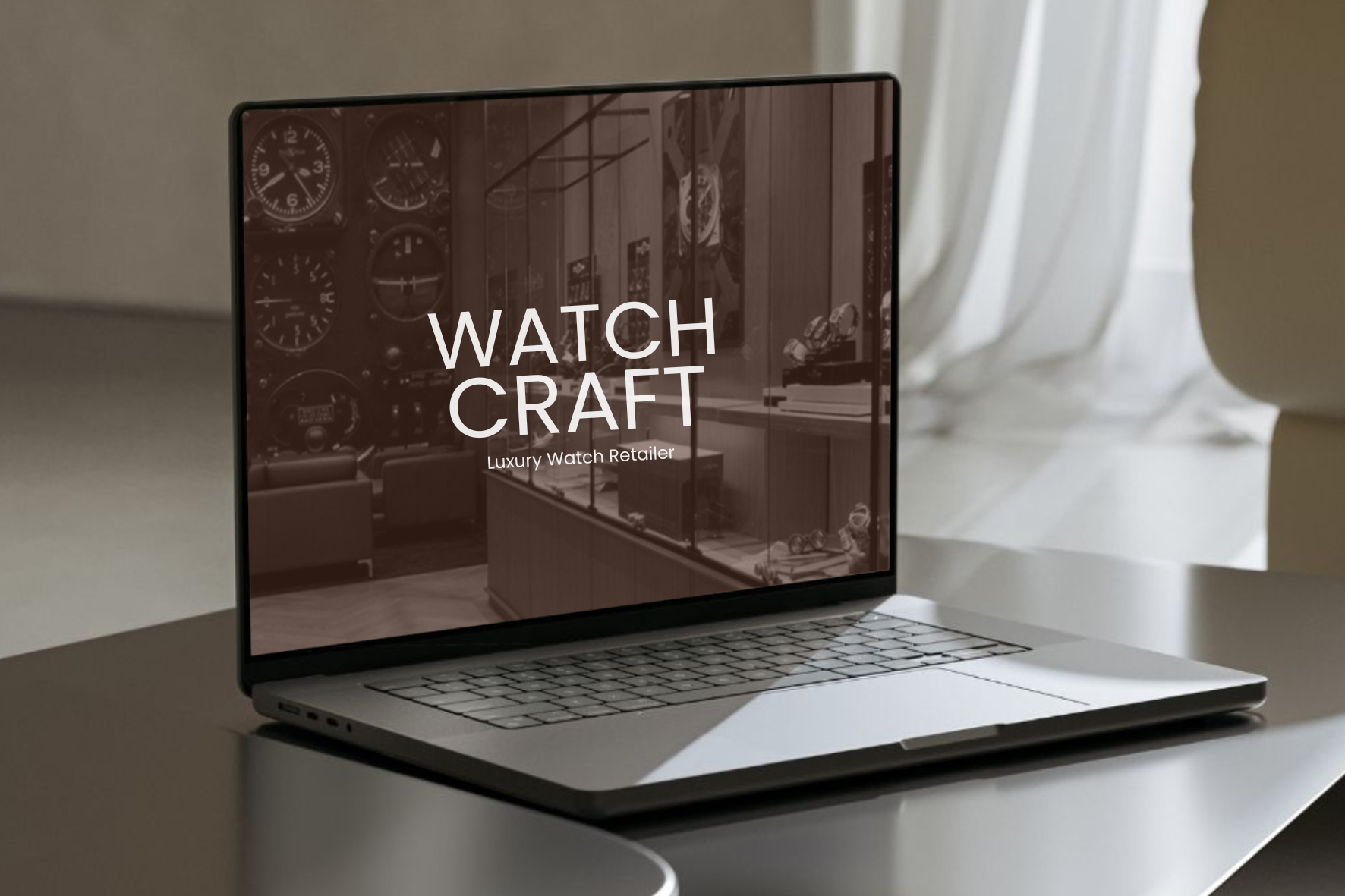
WATCHCRAFT
Crafting time into timeless design.
-
WatchCraft, a new luxury watch retailer, set out to launch with distinction, a brand that embodied craftsmanship, heritage, and the quiet confidence of timeless design. Their ambition was clear from the beginning: they didn’t want to simply sell watches, they wanted to introduce a brand that felt established from its very first day.
Yet their visual identity wasn’t fully expressing that ambition. The craftsmanship of their timepieces held weight and presence, but the brand itself didn’t yet reflect the level of refinement expected in the luxury market. They needed a world built around elegance, precision and trust, a brand that could stand proudly alongside legacy watch houses while still feeling fresh and contemporary.
This is where our partnership began: transforming WatchCraft from a promising retailer into a timeless luxury brand.
-
We repositioned WatchCraft with a brand identity that carried elegance, trust and quiet confidence. The new direction was anchored in minimalism, precision and tone — the same qualities that define a well-crafted watch.
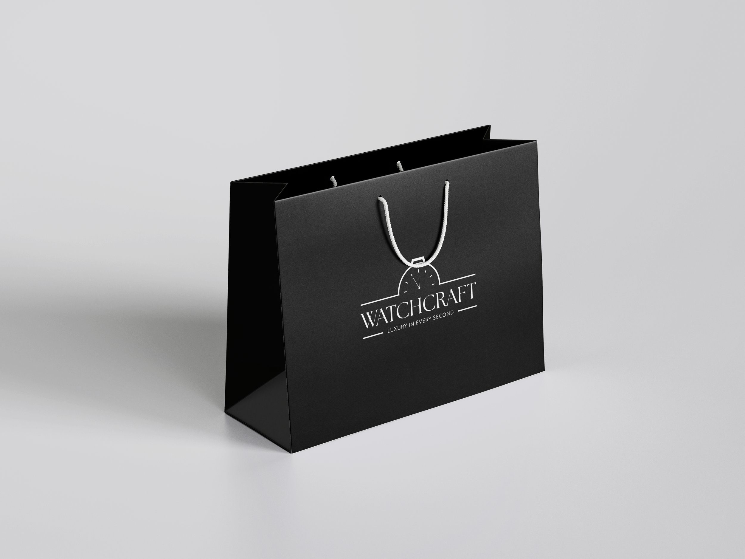
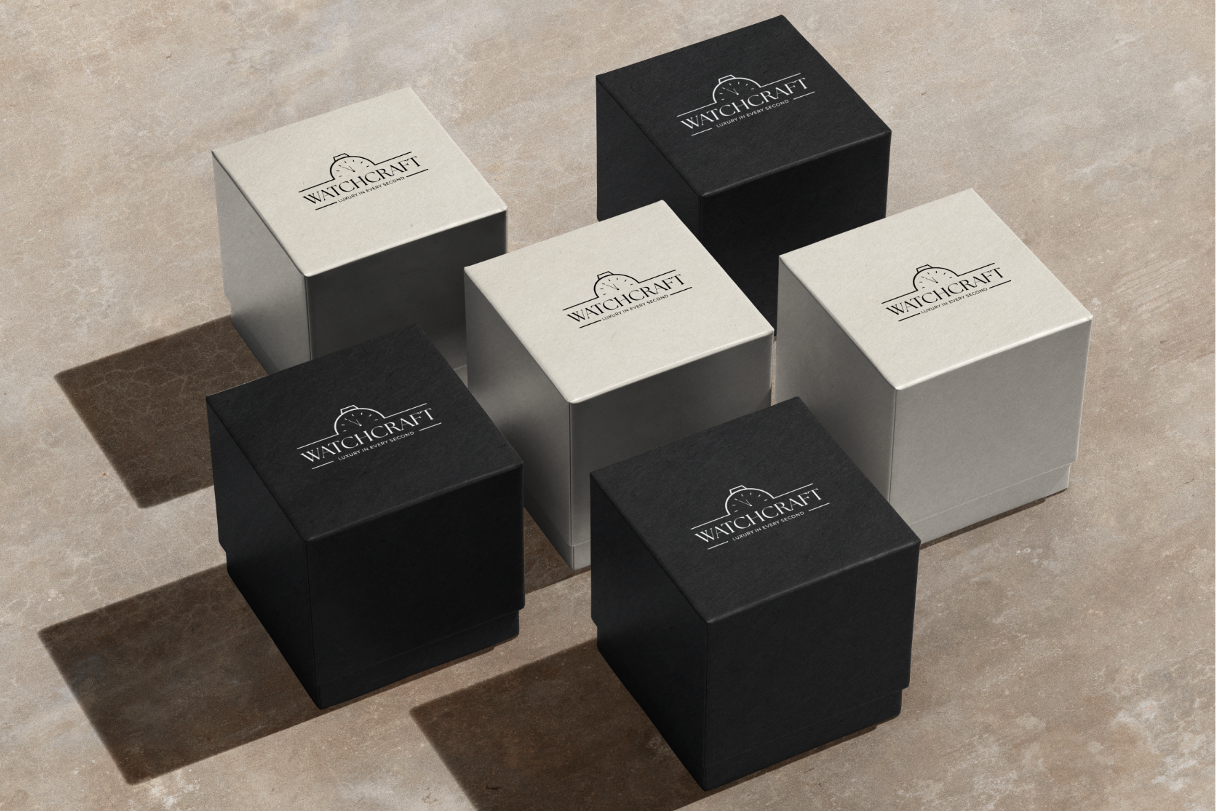
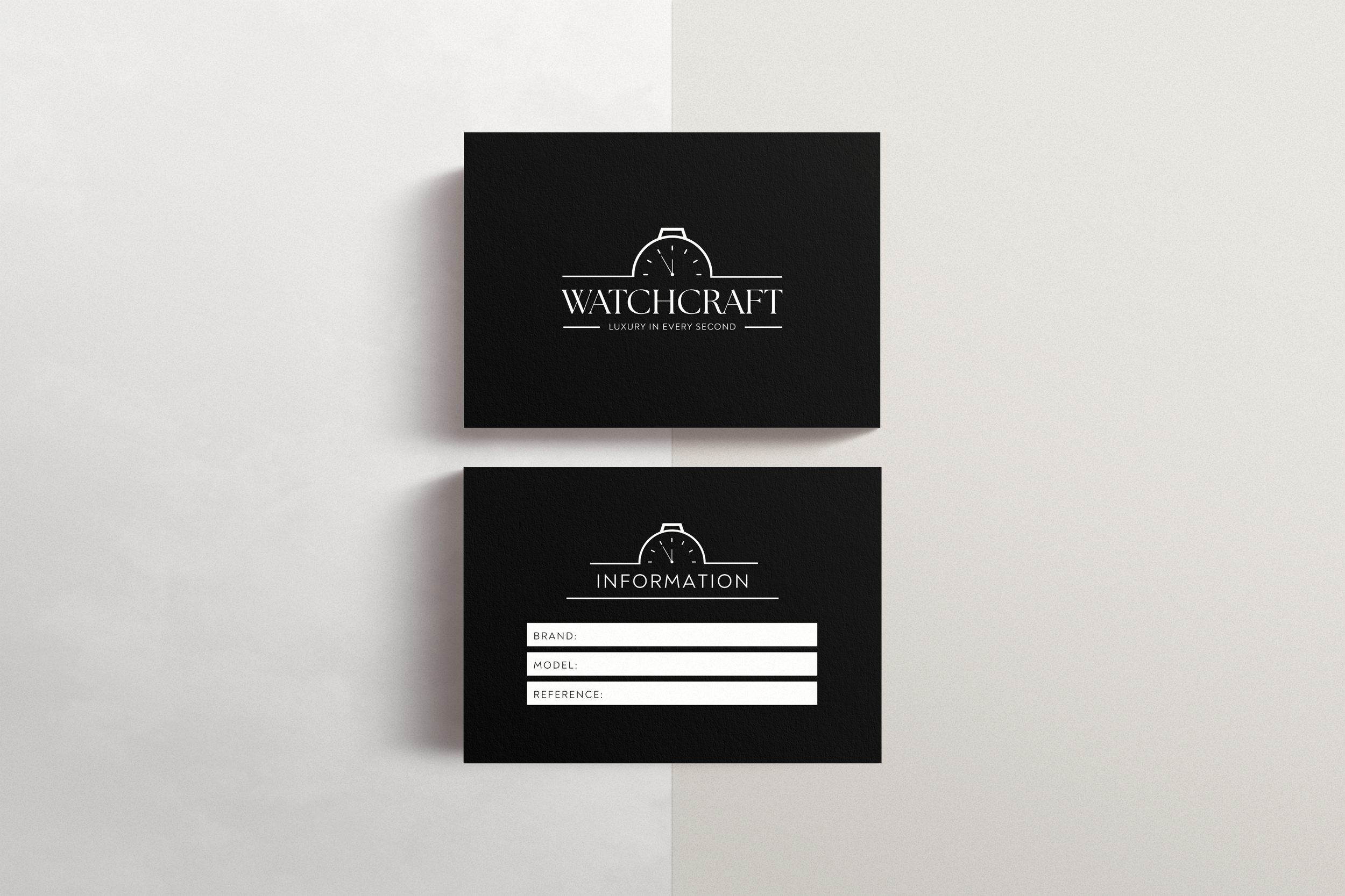
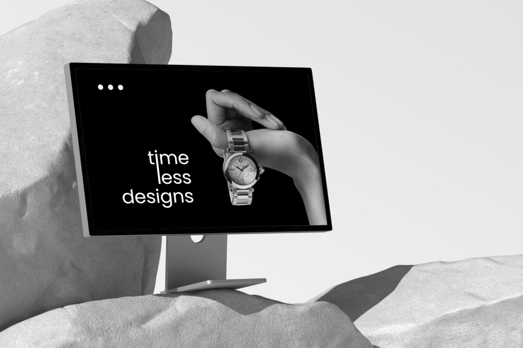
Our focus was to create a system that elevated the brand across every touchpoint: packaging, storefront visuals, in-store experience, client information cards, promotional campaigns, and digital displays. Everything needed to feel coherent, considered and luxurious. We crafted a brand presence that signalled quality before a customer even touched a watch.
-
The design direction centred on restraint, balance and the psychology of timelessness.
The logomark, inspired by the silhouette of a classic watch case, introduced an immediate sense of heritage. It’s subtle enough to feel modern, yet iconic enough to serve as a signature mark across packaging and signage. A monochrome palette anchored the brand in luxury minimalism, allowing the watches to remain the hero.
Typography blended tradition with contemporary simplicity. Elegant serif forms paired with modern letterspacing created a visual rhythm that mirrored horological precision. Generous white space, clean lines and matte textures across packaging evoked the tactile experience of unboxing a premium timepiece.
Every design decision, from the depth of the blacks to the spacing around the logo, was crafted to feel intentional, architectural and enduring.
-
The refreshed identity transformed WatchCraft into a brand with presence, poise and unmistakable luxury. Customers immediately responded to the elevated experience, both online and in person. The cohesive visual system strengthened brand recognition, leading to increased footfall, higher perceived value and stronger product engagement.
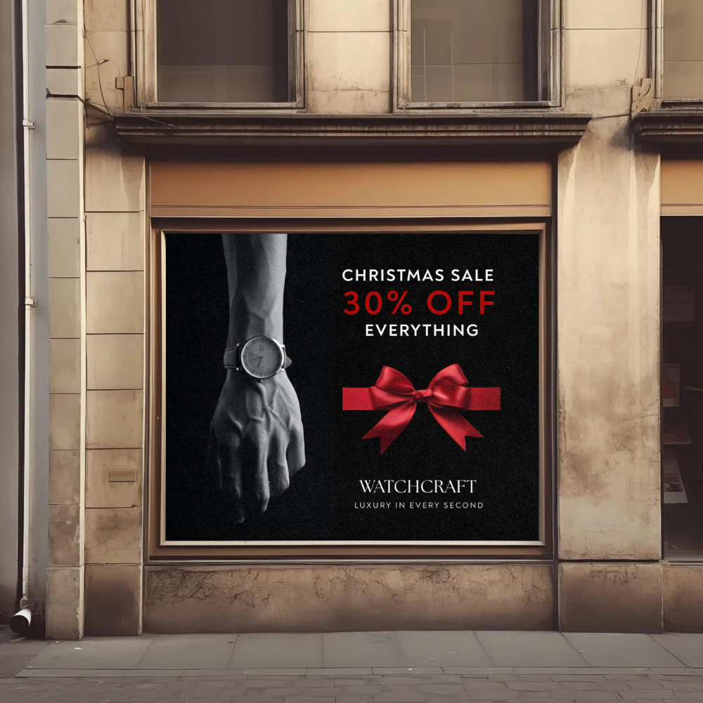
Seasonal campaigns, such as the Christmas sale, performed significantly better with the new visual direction, driving more eyes to the storefront and more interest inside the shop. The elevated packaging and information cards enriched the customer journey, reinforcing WatchCraft’s commitment to quality at every step.
WatchCraft now feels premium, established and timeless, a brand aligned with the craftsmanship of its watches and one ready to grow into a broader luxury market.